Sunday, December 6, 2009
Thursday, December 3, 2009
Monday, November 23, 2009
I thought that this was really nifty, i found it searching the inter webs. The fact that the tree's roots are actually where the titles of family members are is what made me think a lot more than what we used to do in elementary school. How the branches were your family tree instead of your roots. But the fact that the roots are where your family occurs makes much more sense. This is almost like flat art, but i'm not exactly sure how you would categorize this.
This is something that created with that bamboo template. I'm really into those templates, and am hoping to be able to get one soon so i can continue my art digitally. I'm self teaching myself how to use these things, and in photoshop as well. I hope that i can find out more secrets about photoshop so that i can create a better image like those that people find on deviantart that are so extravagant.
Saturday, November 7, 2009
Flat Color Design
Friday, November 6, 2009
I found this on Deviantart. This is a really good example of what flat color design is like. I thought that it was really interesting because i am currently obsessed with this cartoon on adult swim called "metalocalypse". This character is Toki Wartooth. In the actual cartoon there is not a lot of flat color, there is shadow to the characters but it shows that even if you have flat color a cartoon looks good.
This is a picture that i took of my friend, holding an airsoft gun. I edited the color using the "curves" took in photoshop to adjust the shadows and everything else. The two letters at the bottom are his signature "JF" I found the font online though, so it isn't one of my pieces of work. I really enjoyed the colors though, and how the picture isn't completely focused.
Wednesday, October 28, 2009
I thought that this piece was really strange and interesting. I liked how the concept of how women wearing shoes that hurt them, is like wearing shoes that bite at your heels. Thought it was very clever, and the lighting is perfect, the teeth pretty much glow with the shoe as well making it seem more realistic.
This is one of my more silly creations. This is mostly because one of my friends had gotten the swine flu, but it seems that the bug might have gotten to me as well. I took a picture of an eye to make the pig seem even more .. i guess you could say "infected" and the pink font to highlight the actual "h1n1" virus.
But on a more serious note...
This shot, is one that my friend sylvain took. I took the photo and made it into a semi-collage. I wanted my friend and I to be the center of it, with the globe-type structure that helps create an illusion of being in a different world i guess. I took some images for the background that brings out more color.
Wednesday, October 21, 2009
Assignment 3 Posters
This first poster is one that i decided to make, during our trip to portland. In portland my friend was being treated for cancer, and so we had to put on these gloves, masks, and outfits so we wouldn't get anything that he had, or take anything we had outside with us. Either way. I began to think about a crazy doctor that was a character in a video game. This also gave me an idea to photoshop my friend that somewhat resembles the character in the game. Thus, creating an insane picture of my friend and a poster.
I couldn't think of much for the second one. I wanted it to look somewhat like a book cover, except i'm not sure what kind of book would have these many colors though. But I found most of the pictures from the internet, and mad the rest by using photoshop.
Sunday, October 18, 2009
So my friend found this image, but the first time i saw it i was very impressed on how simplistic that the image was. It has this astronaut, in space, with the text "I see no God up here.." the quote directed from Yuri Gagarin. The way i saw it was, that there would be no God within science, and that every scientist that is kept to their profession seems to always head toward an Atheist way of thinking. Science or Religion. But to get to the artistic view of this, I really loved how the text can really impact a piece of art. Even if you have a really simple picture just like this.
Type Composition
My composition on the letter "P".
Not sure what all i should talk about this one. Mainly that the P's are all around different colors. The background was made up of black and a gray tint of clouds being shaded or avoided. I thought that a black background might make the P's stand out a little more. Which i believe it did, but mainly the P's that have been shown as White.
"S"
It makes the world "p.s." almost like space invaders.
Saturday, October 10, 2009
Collage
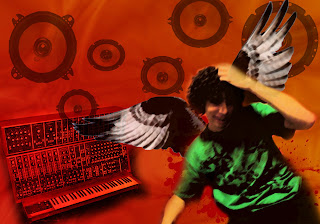
This is my collage, its got a mix between music and flying. The person there is a friend of mine which i decided to use as a model to help me configure this lovely illustration of what its like to listen to music. Or how it's like to listen to music in my head. A whole bunch of speakers that I crafted from the internet, and then a synthesizer as well to just give it an extra touch. I borrowed the wings from a bird and they are used to show how when listening to music is almost like having wings, to bring you up into another place. (or at least that's how i saw it in my head)
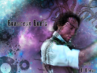
here is another, which i've crated for my friend Sylvain and his DJ time to get him more fans and more listeners. I took a few objects from the internet, like tentacles, the brain and spine, and the broken records. I used an image that someone had taken of him as well, but i created the background by myself, using some photoshop brushes that i found on the internet as well. The internet is such a great source for random items you need.
Thursday, October 1, 2009
First Blog Entry
This is where i will be entering my assignments for Digital Media Foundations. Some original work, some thoughts, and photos.
Subscribe to:
Posts (Atom)